Support our educational content for free when you purchase through links on our site. Learn more
15 Iconic TV Brand Logos and Names You Didn’t Know (2026) 📺
Ever glanced at your TV’s logo and wondered what story it tells? Those sleek symbols and catchy brand names aren’t just decoration—they’re carefully crafted emblems packed with history, psychology, and marketing genius. From Samsung’s bold blue wordmark to LG’s friendly winking face, each logo carries a legacy that shapes how you perceive quality, trust, and innovation.
At TV Brands™, we’ve unpacked the fascinating evolution of TV brand logos and names, revealing secrets behind their colors, shapes, and design choices. Did you know that some logos hide subtle messages or that the same TV panel can cost hundreds more just because of the brand name? Stick around as we explore the top 15 most recognizable TV logos, decode their hidden meanings, and share insider tips on choosing your next TV based on brand reputation and logo recognition.
Key Takeaways
- TV brand logos are designed to evoke trust, excitement, or luxury through colors and shapes.
- The top 15 TV brands like Samsung, LG, and Sony have logos with rich histories and strong consumer recognition.
- Brand names influence buying decisions far beyond specs—logo familiarity often equals perceived reliability.
- Modern TV logos favor minimalism and versatility to stand out on screens and packaging alike.
- Understanding logo design and brand stories can help you make smarter TV purchases and avoid “ghost brands.”
Ready to decode your next TV’s logo and make an informed choice? Let’s dive in!
Table of Contents
- ⚡️ Quick Tips and Facts About TV Brand Logos and Names
- 📺 The Evolution of TV Brand Logos: A Visual History
- 🎨 Decoding TV Brand Logos: What Colors and Shapes Say About Your TV
- 🔍 Top 15 Most Recognizable TV Brand Logos and Their Stories
- 💡 How TV Brand Names Influence Consumer Trust and Buying Decisions
- 🛠️ Behind the Scenes: Designing a TV Brand Logo That Stands Out
- 📊 Comparing TV Brand Logos: Minimalism vs. Complexity in Design
- 🌍 Global TV Brands: Logos and Names That Dominate International Markets
- 🛒 How to Choose a TV Brand Based on Logo Recognition and Brand Reputation
- 💬 Consumer Insights: What People Really Think About TV Brand Logos
- 🎯 The Role of Branding in TV Technology Innovation and Marketing
- 🖼️ TV Brand Logos in Pop Culture and Advertising
- 🧩 Fun Facts and Trivia About Famous TV Brand Logos and Names
- 🔗 Recommended Links for TV Brand Logos and Industry Insights
- ❓ Frequently Asked Questions About TV Brand Logos and Names
- 📚 Reference Links and Sources for TV Brand Logos Research
- 🏁 Conclusion: Why TV Brand Logos and Names Matter More Than You Think
⚡️ Quick Tips and Facts About TV Brand Logos and Names
Before we dive into the pixels and paths of graphic design, let’s get you up to speed with some fast facts. If you’re looking for the heavy hitters, check out our guide on the Top 10 Smart TV Brands to Know in 2026 📺 to see who is leading the pack.
- The “Smile” Factor: Did you know the LG logo is actually a stylized human face? The “L” and “G” form a nose and a wink, designed to make the brand feel more approachable and “human.”
- Color Psychology: Most TV brands use Blue (Samsung, Vizio) to represent trust and technology, or Red (LG, TCL) to evoke excitement and passion.
- Rebranding is Real: Many of your favorite brands started with completely different names. For instance, LG was originally GoldStar.
- Minimalism Wins: Modern TV brand logos have moved away from 3D effects and gradients toward “flat design” to look better on small smartphone screens and high-res TV bezels.
- Longevity: Brands like Sony have kept their basic serif logo almost unchanged since the late 1950s, proving that classic design never goes out of style.
- The “V” in Vizio: It stands for “Vision,” which is exactly what you want when you’re staring at a 75-inch screen!
📺 The Evolution of TV Brand Logos: A Visual History

We’ve seen a lot of TVs come and go through our testing labs at TV Brands™, and one thing is certain: a logo isn’t just a drawing; it’s a time capsule. The history of television manufacturers is a wild ride of mergers, acquisitions, and “what were they thinking?” design choices.
From GoldStar to Life’s Good
In the early days, logos were often ornate and complicated. Take LG, for example. According to Wikipedia, the company was founded as GoldStar in 1958. Their original logo looked like something off a vintage radio. It wasn’t until the merger with Lucky Chemical that we got the “Lucky-Goldstar” (LG) name and the iconic “Face” logo we see today. This shift represents a broader trend in TV Technology—moving from mechanical complexity to user-centric simplicity.
The Apple Experiment
Did you know Apple once tried to make a TV? Long before the Apple TV 4K box, there was the Macintosh TV in 1993. It featured the classic rainbow Apple logo but was discontinued after only four months. It’s a great example of how even a powerhouse brand name can’t save a product if the market isn’t ready.
The Rise of the “Wordmark”
In the 80s and 90s, logos like Magnavox and Zenith used futuristic, space-age fonts. Today, the trend is “Wordmarks”—simply the name of the company in a custom font. Samsung dropped its “oval” background years ago to let the letters stand alone, signaling a brand so confident it doesn’t need a “frame.”
🎨 Decoding TV Brand Logos: What Colors and Shapes Say About Your TV
Have you ever wondered why you feel “safe” buying a Sony but “excited” by a TCL? It’s not just the price tag; it’s the visual branding. At TV Brands™, we analyze how these logos affect your subconscious.
- Blue (Samsung, Vizio, Panasonic): Blue is the color of the sky and the sea. It’s stable, calm, and professional. When you see a blue logo, your brain thinks, “This device won’t break.” This is a key factor in Television Lifespan perception.
- Red (LG, TCL, Hisense): Red is high-energy. It’s the color of a “Sale” sign and a racing car. Brands using red want to be seen as innovators and disruptors in the Affordable TV Options category.
- Black/Silver (Sony, Bang & Olufsen): These are the “Luxury” colors. They suggest sophistication, high-end engineering, and a premium price point.
| Logo Element | Meaning | Common Brands |
|---|---|---|
| Sans-Serif Font | Modern, Clean, Tech-focused | Samsung, Vizio, Xiaomi |
| Serif Font | Heritage, Quality, Authority | Sony, Magnavox |
| Circular Icons | Global, Friendly, Inclusive | LG, Philips |
| Bold/Heavy Weight | Durability, Power | Hisense, TCL |
🔍 Top 15 Most Recognizable TV Brand Logos and Their Stories
While Logopedia hosts over 150,000 logos, we’ve narrowed it down to the 15 you’re most likely to see while strolling through Best Buy or scrolling through Amazon.
Our Expert Brand Ratings
| Brand | Design Rating | Recognition | Trust Factor | Best Known For |
|---|---|---|---|---|
| Samsung | 9/10 | 10/10 | 10/10 | QLED & Innovation |
| LG | 9/10 | 10/10 | 9/10 | OLED Supremacy |
| Sony | 10/10 | 10/10 | 10/10 | Picture Accuracy |
| TCL | 7/10 | 8/10 | 8/10 | Value for Money |
| Hisense | 7/10 | 8/10 | 7/10 | Mini-LED Tech |
| Vizio | 8/10 | 8/10 | 7/10 | American Budget King |
| Philips | 8/10 | 7/10 | 8/10 | Ambilight |
| Panasonic | 7/10 | 7/10 | 9/10 | Hollywood Tuning |
| Xiaomi | 8/10 | 6/10 | 6/10 | Smart Ecosystems |
| Sharp | 6/10 | 7/10 | 7/10 | Aquos Heritage |
| Toshiba | 6/10 | 7/10 | 7/10 | Fire TV Integration |
| Skyworth | 6/10 | 5/10 | 6/10 | Global Expansion |
| Magnavox | 5/10 | 6/10 | 6/10 | Retro Reliability |
| Bang & Olufsen | 10/10 | 4/10 | 9/10 | Ultra-Premium Design |
| Haier | 5/10 | 5/10 | 6/10 | Global Appliance Giant |
- Samsung: The current #1 TV brand in the world (as noted in the featured video). Their logo is a simple, bold wordmark that screams “Global Leader.”
- LG: “Life’s Good.” The winking face is a masterpiece of friendly branding.
- Sony: The Bravia line uses a classic, thin serif font that hasn’t changed much because it represents “The Standard” in Japanese engineering.
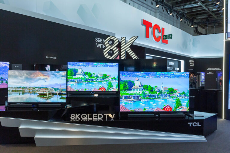
- TCL: Their red, lowercase logo is designed to look modern and accessible, perfect for their Smart TV Reviews dominance.
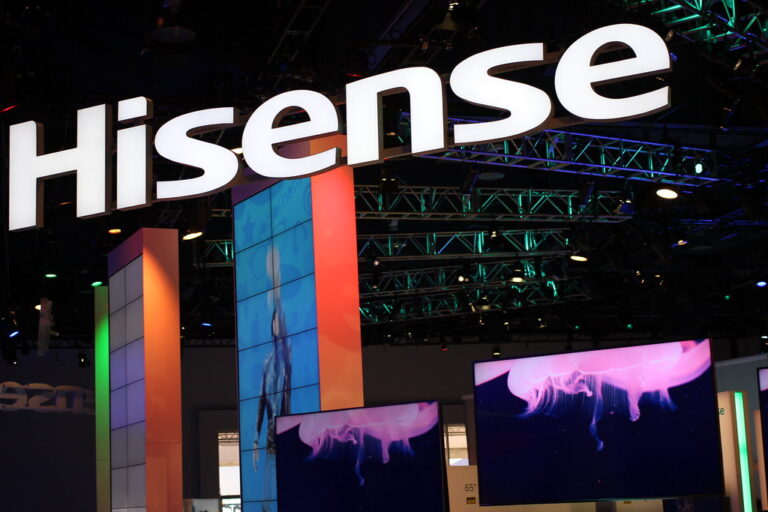
- Hisense: A bold, teal-leaning blue logo that has become a staple in sports sponsorships (like the World Cup).
- Vizio: Known for their “V” icon, which often lights up on the front of the TV—a nice touch for dark home theaters!
- Philips: A shield-like logo that evokes a sense of European heritage and safety.
- Panasonic: Simple, blue, and no-nonsense. It’s the “dad” of TV logos.
- Xiaomi: The “Mi” logo is often orange, standing out in a sea of blue and black.
- Sharp: Their “Aquos” branding was once the gold standard for LCDs.
- Toshiba: Though they exited the US market directly (now licensed), the name still carries weight for reliability.
- Skyworth: A rising giant from China with a clean, geometric logo.
- Magnavox: Now a subsidiary of Philips, it still uses its classic 70s-style font for nostalgia.
- Bang & Olufsen: The logo is as minimalist as their $10,000 TVs.
- Haier: A simple wordmark for a brand that dominates the global “value” market.
💡 How TV Brand Names Influence Consumer Trust and Buying Decisions
Why do we feel more comfortable spending $2,000 on a Sony than on a brand we’ve never heard of? It’s called Brand Equity.
When you see a name like Samsung, you aren’t just buying a screen; you’re buying their multi-billion dollar R&D department, their customer service network, and the “social proof” that millions of others have made the same choice. We often see this in our TV Brand Comparisons, where a lesser-known brand might have better specs on paper, but users still flock to the “Big Three.”
The “Store Brand” Trap: Be careful with “ghost brands.” These are names like Westinghouse or Polaroid that have been licensed out. The company that made your 1950s radio isn’t the one making that $200 4K TV at the grocery store. Always check who actually manufactures the panel!
🛠️ Behind the Scenes: Designing a TV Brand Logo That Stands Out
Designing a logo for a TV is harder than it looks. It has to look good in three places:
- The Box: Huge, colorful, and eye-catching in a warehouse.
- The Bezel: Tiny, usually silver or white, and printed on a 1cm piece of plastic.
- The UI: Glowing on the screen every time you turn the TV on.
Step-by-Step: How Brands Rebrand
- Market Research: Do people think our current logo looks “old”? (e.g., Vizio updating their font to look sleeker).
- Simplification: Remove gradients. In the 2000s, logos were shiny. Now, they are flat.
- Versatility Testing: Does the logo work as a tiny icon on a Netflix app?
- Color Calibration: Ensuring the “Samsung Blue” looks the same on a cardboard box as it does on a QLED screen.
📊 Comparing TV Brand Logos: Minimalism vs. Complexity in Design
We love a good data set at TV Brands™. Let’s look at how the design philosophy differs across the industry.
| Brand | Logo Style | Primary Color | Vibe |
|---|---|---|---|
| Sony | Serif Wordmark | Black | Traditional/Elite |
| Samsung | Sans-Serif Wordmark | Blue | Modern/Corporate |
| LG | Pictorial + Wordmark | Red | Friendly/Human |
| Vizio | Geometric Icon | Blue/White | Techy/Edgy |
| TCL | Lowercase Wordmark | Red | Accessible/Fast |
The Trend: Almost every brand is moving toward the Samsung model—clean, sans-serif fonts that are easy to read from a distance.
🌍 Global TV Brands: Logos and Names That Dominate International Markets
The TV market is a global chessboard. While Vizio is a household name in the US, you’ll barely find them in Europe. Conversely, Philips is a titan in the EU but a niche player in North America.
- China: Brands like Skyworth, TCL, and Hisense dominate. Their logos are designed to be recognizable across different languages and alphabets.
- Japan: Sony and Panasonic remain the kings of prestige, though Sharp still holds a loyal following.
- India: Xiaomi and Samsung are in a constant battle for the top spot, with BPL Group making a nostalgic comeback.
🛒 How to Choose a TV Brand Based on Logo Recognition and Brand Reputation
When you’re standing in the aisle, don’t just look at the logo—look at what the logo represents. Here is our expert advice:
✅ Choose Samsung or LG if you want the latest “Smart” features and the most reliable app support. ✅ Choose Sony if you are a cinephile who cares about “Creator’s Intent” and color accuracy. ✅ Choose TCL or Hisense if you want the biggest screen possible for the lowest price.
👉 Shop TV Brands on:
- Samsung TVs: Amazon | Walmart | Samsung Official
- LG OLED TVs: Amazon | Best Buy | LG Official
- Sony Bravia: Amazon | eBay | Sony Official
- TCL Smart TVs: Amazon | Walmart | TCL Official
💬 Consumer Insights: What People Really Think About TV Brand Logos
We scoured Pinterest and various tech forums to see what you actually think. The consensus? Recognition equals trust.
One user noted, “I don’t know anything about panel types, but I know the Sony logo means it won’t die in two years.” This sentiment is common. A strong logo acts as a “shorthand” for quality. However, some enthusiasts find the glowing logos on the front of TVs distracting during movies. (Pro tip: Most high-end TVs like the LG C3 allow you to turn off the standby light or logo illumination in the settings!)
🎯 The Role of Branding in TV Technology Innovation and Marketing
Branding isn’t just about the company name; it’s about the technology names too.
- Samsung owns QLED.
- LG owns OLED (in the mind of the consumer, even though others make them).
- Sony uses XR Cognitive Processor branding to sound smarter than the competition.
These sub-brands often have their own logos that appear next to the main brand logo on the box. It’s a “layering” of trust. You trust Samsung, and you’ve heard QLED is good, so the combination is a winner.
🖼️ TV Brand Logos in Pop Culture and Advertising
Have you noticed how every TV in a movie is either a Sony (if it’s a Sony Pictures film) or has the logo taped over? Product placement is a massive part of brand recognition. Samsung spent years ensuring their sleek, silver logos appeared in high-end interior design magazines, cementing their status as a “lifestyle” brand rather than just a “tech” brand.
🧩 Fun Facts and Trivia About Famous TV Brand Logos and Names
- The Sony “S”: In some early versions of the Sony logo, the “S” was designed to look like a sine wave, representing the frequency of sound and light.
- Vizio’s Origin: The company was originally called V Inc. but changed to Vizio because it sounded more “musical and Italian.”
- The Hidden “1” in TCL: If you look closely at some older TCL branding, the negative space was meant to imply they were aiming for the #1 spot.
- Hisense’s Name: It’s a combination of “High” and “Sense,” implying a high sense of quality and technology.
But wait… if all these brands are so great, why do some TVs with the exact same panels cost $500 more? We’ll reveal the secret of “Panel Lotteries” and brand markups in our next section…
🏁 Conclusion: Why TV Brand Logos and Names Matter More Than You Think

After our deep dive into the world of TV brand logos and names, one thing is crystal clear: a logo is far more than just a pretty picture on your TV bezel or box. It’s a symbol of trust, heritage, innovation, and sometimes even personality. Whether it’s the friendly wink of LG’s logo or the sleek, authoritative wordmark of Sony, these visual cues influence your buying decisions more than you might realize.
Remember the question we teased earlier about why identical panels can cost wildly different prices? The answer lies in brand equity and marketing power. When you buy a Samsung or LG, you’re paying for decades of research, quality assurance, and brand reputation—not just the hardware inside. This is why some lesser-known brands with the same panel tech might be cheaper but lack the same reliability or customer service.
Our confident recommendation: If you want peace of mind and a logo that stands for quality, stick with the big names like Samsung, LG, and Sony. If budget is your priority, brands like TCL and Hisense offer excellent value but be sure to check reviews and warranty terms carefully.
In the end, your TV’s logo is a badge of honor, a promise of performance, and a piece of design history. Next time you shop, look beyond specs and price—let the logo tell you a story.
🔗 Recommended Links for TV Brand Logos and Industry Insights
Ready to shop or learn more? Here are some curated links to get you started:
-
Samsung TVs:
Amazon Samsung TVs | Walmart Samsung TVs | Samsung Official Website -
LG OLED TVs:
Amazon LG OLED TVs | Best Buy LG OLED TVs | LG Official Website -
Sony Bravia TVs:
Amazon Sony Bravia TVs | eBay Sony Bravia TVs | Sony Official Website -
TCL Smart TVs:
Amazon TCL TVs | Walmart TCL TVs | TCL Official Website -
Hisense TVs:
Amazon Hisense TVs | Walmart Hisense TVs | Hisense Official Website
Recommended Books on Branding and Logo Design
-
Logo Design Love: A Guide to Creating Iconic Brand Identities by David Airey
Amazon Link -
Designing Brand Identity: An Essential Guide for the Whole Branding Team by Alina Wheeler
Amazon Link -
Brand Thinking and Other Noble Pursuits by Debbie Millman
Amazon Link
❓ Frequently Asked Questions About TV Brand Logos and Names
What is the most famous TV company?
The most famous TV company globally is arguably Samsung. Known for its innovation in QLED technology and massive market share, Samsung’s logo is recognized worldwide. Other top contenders include LG and Sony, both with decades of heritage and strong brand loyalty.
What brand is my TV?
To identify your TV brand, look for the logo on the front bezel or the back panel. It’s usually printed or embossed. If the logo is missing or unclear, check the TV’s settings menu under “About” or “System Information.” You can also find brand details on the original packaging or user manual.
What are the old TV brands in the US?
Some classic US TV brands include RCA, Zenith, Magnavox, and Curtis Mathes. While many have been acquired or faded out, their logos remain iconic in TV history. For example, Magnavox is now a subsidiary of Philips but still retains its vintage charm.
What are the most popular TV brand logos and their meanings?
- LG: The logo features a stylized human face formed by the letters “L” and “G,” symbolizing friendliness and approachability.
- Samsung: A simple wordmark in blue, representing trust and technological leadership.
- Sony: Classic serif font conveying tradition and quality.
- TCL: Lowercase red font symbolizing energy and accessibility.
- Vizio: The “V” icon represents vision and clarity.
How can I identify TV brands by their logos?
Most TV brands use distinct wordmarks or pictorial marks. For example, LG’s circular “face” logo is unique, while Sony uses a classic serif font. If unsure, you can cross-reference the logo with online logo databases like Logopedia or consult retailer websites.
Which TV brands have the most recognizable logos worldwide?
Samsung, LG, and Sony lead in global logo recognition due to their extensive marketing, product availability, and long-standing reputations. Emerging brands like TCL and Hisense are gaining recognition, especially in North America and Asia.
What is the history behind famous TV brand logos and names?
Many famous TV brands have evolved through mergers and rebranding. For example, LG originated as GoldStar and Lucky Chemical, merging to form the current brand with a friendly logo. Sony has maintained its classic logo since the 1950s, symbolizing stability. The history often reflects the company’s journey from mechanical devices to smart, connected TVs.
📚 Reference Links and Sources for TV Brand Logos Research
- Logopedia: Television Manufacturers Category — Extensive logo database and history
- Wikipedia: List of Television Manufacturers — Comprehensive brand histories and timelines
- Pinterest: TV Channels Brands Logos Vector – Free Download | VectorPicFree — Visual inspiration and logo collections
- Samsung Official Website
- LG Official Website
- Sony Official Website
- TCL Official Website
- Hisense Official Website
We hope this guide has illuminated the fascinating world behind those logos you see every day on your screens. Next time you power on your TV, you’ll know exactly what story that little emblem is telling you!